Perfecting the One Page Layout: A Comprehensive Guide
Introduction to One Page Websites
In recent years, one page websites have emerged as a significant trend in modern web design. Unlike traditional multi-page websites that require users to navigate through various sections, one page design condenses a website’s content into a single webpage. This approach allows for streamlined navigation and enhanced user experience, catering to the fast-paced nature of internet consumption today.
The growing popularity of one page websites can be attributed to several factors. First and foremost, the inherent simplicity they offer is appealing both to users and designers. By eliminating unnecessary clicks and distractions, one page websites make it extremely easy for visitors to access the essential information they seek. This user-centric design philosophy improves the overall browsing experience, as users can quickly scroll through content without facing the frustration of cumbersome navigation menus.
One page websites are particularly advantageous for displaying focused content. They allow designers to curate the information in a way that naturally guides the user’s attention from one section to another, maximizing engagement. This format is particularly effective for promotional sites, portfolios, or event pages, where telling a cohesive story in a compact space is crucial. Additionally, the rise of mobile browsing has further propelled the demand for one page sites, as they are inherently more compatible with smaller screens, facilitating easier content consumption.
Moreover, one page websites can have positively impactful SEO implications. Search engines, favoring well-structured and easily navigable websites, may reward one page designs with better visibility in search results. By concentrating important keywords and relevant content in one place, businesses have the potential to enhance their online presence significantly.
Benefits of a One Page Layout
A one page layout presents numerous advantages that can significantly enhance the overall effectiveness of a website. Firstly, improved user experience is one of the primary benefits. A one page layout allows users to navigate seamlessly through content without the interruptions that often accompany multi-page designs. With all relevant information accessible within a single scrollable space, visitors can easily absorb the essential details without the friction of clicking through multiple pages.
Additionally, this layout format promotes easier navigation. By placing all information on one page, developers can incorporate smooth scrolling effects and anchor links that lead users directly to the sections they need. This simplicity not only enhances the user experience but also encourages users to spend more time engaging with the content, which can lead to higher conversion rates.
Faster loading times are another key advantage of a one page layout. By consolidating content into a single page, it can minimize the number of server requests, resulting in quicker load times. This speed is crucial for retaining visitors, as studies show that users are likely to abandon a site if it takes more than three seconds to load. A website that operates efficiently can improve overall satisfaction and decrease bounce rates.
Moreover, enhanced storytelling capabilities are integral to a one page layout. By effectively using visual design, a cohesive narrative can be established. Designers can guide users through a journey that reveals a brand’s story, values, and offerings in a compelling manner. This immersive experience strengthens emotional connections between the user and the website, ultimately leading to a deeper engagement.
Incorporating a one page layout can vastly improve user experience, navigation, loading times, and storytelling, making it a compelling choice for modern web design.
When to Choose a One Page Website
The decision to utilize a one page website should be guided by the specific needs of the project at hand. One page layouts are particularly well-suited for scenarios that demand efficiency and conciseness in communication. For instance, event promotions benefit significantly from a single page design. By consolidating all vital information—such as date, location, and agenda—onto one page, it becomes easier for potential attendees to quickly review the details without navigating through multiple sections. This streamlined access can enhance user experience and drive higher engagement.
Another compelling use case for a one page layout is the personal portfolio. Creative professionals, such as photographers, designers, and writers, often have limited content to showcase. A one page website allows them to highlight their best work without overwhelming visitors with excessive navigation. The focused presentation enhances the potential client’s or employer’s ability to assess the individual’s capabilities at a glance, making the decision-making process smoother.
Product landing pages also reap the benefits of a one page design. These pages typically aim to convert visitors into customers by providing a straightforward overview of a specific product or service. By communicating essential product information, benefits, and calls to action all on one page, businesses can reduce friction and retain user attention effectively. This approach can be particularly beneficial for startups and small businesses, where resources for extensive web development may be limited. The clarity and directness of a one page layout can contribute significantly to the overall marketing strategy by simplifying user interactions and enhancing conversion rates.
In conclusion, selecting a one page website layout can be advantageous in various scenarios, particularly for event promotions, personal portfolios, product landing pages, and small business websites. The effectiveness of this design lies in its ability to present information succinctly, ultimately improving user experience and engagement.
Essential Tips for Designing a One Page Website
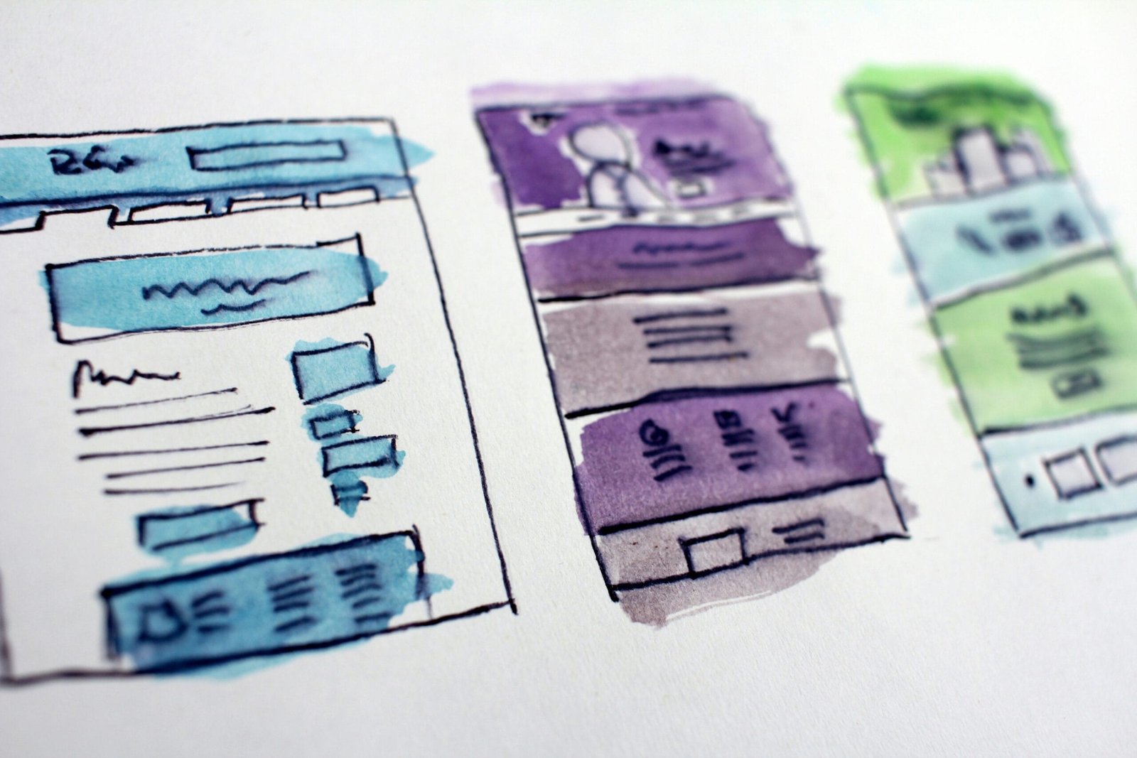
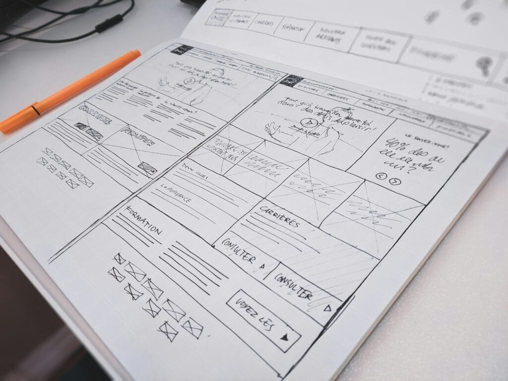
Designing a one page website requires careful consideration of various factors to ensure a cohesive, user-friendly experience. One of the first aspects to focus on is layout organization. Clearly define sections within the website to enable visitors to navigate effortlessly. A structured layout comprising distinct areas, such as navigation, content, and footer, enhances overall user experience. Utilizing a grid system can assist in effectively organizing these components.
Another critical element is the establishment of visual hierarchy. By employing size, color, and spacing variations, you can guide users’ attention towards fundamental content sections. To create a smooth flow of information, prioritize the placement of key headings and subheadings, ensuring they are evident and consume attention appropriately. The implementation of larger text for primary topics contrasted with smaller subtext helps solidify this hierarchy.
Whitespace plays a vital role in one page web design, contributing to a clean and uncluttered feel. By incorporating sufficient whitespace, users can focus on essential elements without feeling overwhelmed. This space between paragraphs, images, and sections dramatically improves readability and overall aesthetics. Effective use of whitespace is essential for balancing content and visual elements, which in turn enhances user engagement.
Additionally, consider the strategic placement of calls to action (CTAs). CTAs should be clearly visible and intuitively located to encourage interactions. Icons, buttons, or hyperlinks should stand out effectively to prompt users towards desired actions. Place primary CTAs early within the content, and ensure they are repeated throughout the layout without being intrusive.
By focusing on these essential tips—layout organization, visual hierarchy, effective use of whitespace, and the strategic implementation of calls to action—you can create an engaging and functional one page website that resonates with visitors.
Utilizing Navigation Effectively
In a one-page layout, effective navigation is crucial for guiding users through the content seamlessly. The primary objective is to create a streamlined experience that allows visitors to find the information they seek without confusion. Intuitive navigation menus play a fundamental role in achieving this goal. By employing a clear and concise menu design, users can easily identify the various sections of the page. The use of descriptive labels is vital; each label should represent the content that lies beneath it, minimizing the potential for misinterpretation.
Implementing anchor links is another vital strategy for enhancing navigation in a one-page layout. Anchor links allow users to jump directly to specific sections within the page, improving their overall experience. When a user clicks on an anchor link, they should be smoothly scrolled to the relevant content, which is made possible by using charming smooth scrolling effects. This creates an engaging interaction that encourages users to explore different areas of the site. Moreover, it is essential to ensure that these links are easily accessible, prominently displayed within the navigation menu.
To further enhance the user experience, it is beneficial to maintain a consistent design and layout throughout the navigation elements. This includes keeping the navigation menu fixed at the top of the page as users scroll, which ensures that essential links remain visible and reachable at all times. Additionally, highlighting the section the user is currently viewing by changing the appearance of the corresponding menu item provides a visual cue, reinforcing the user’s context within the page. By prioritizing user-friendly navigation, one-page layouts can facilitate fluid exploration, leading to increased satisfaction and engagement from visitors. In conclusion, meticulous attention to navigation allows for a refined approach to information delivery and user interaction.
Incorporating Engaging Visuals
In today’s digital landscape, the incorporation of engaging visuals into a one page website is paramount. Visual elements, such as images, videos, and animations, serve not only to enhance aesthetic appeal but also to effectively convey information and capture the attention of visitors. When used strategically, these visuals can significantly improve user engagement and retention on a one page layout.
Images play a crucial role in storytelling on a website. High-quality, relevant photographs can evoke emotions and create a connection with the audience. It is essential to choose visuals that align with the content and the message you intend to deliver. Additionally, using infographics can simplify complex information and present it in an easily digestible format, making it more approachable for the user.
Videos have become increasingly vital in website design. They allow for dynamic content that can convey messages more swiftly than text alone. Brief video clips can summarize product features, provide tutorials, or deliver captivating stories that resonate with viewers. However, to maximize performance, it is advisable to use compressed video files and host them on platforms optimized for loading speed. This ensures that they do not hinder the overall performance of the site.
Furthermore, animations can draw attention and guide users through the content. Subtle animations can engage users by providing visual cues that enhance navigation and interactiveness. However, it is crucial to balance their use; excessive animations may lead to distraction or even distort the intended message.
To optimize visuals for performance, consider employing responsive design principles, ensuring that images scale appropriately across devices. Utilize formats like WebP and tools such as lazy loading to enhance loading speeds. By effectively incorporating visuals, one page websites can truly master user engagement and content delivery.
Optimizing for Mobile Devices
In today’s digital landscape, mobile optimization has become an essential factor in the design and functionality of one page websites. As increasingly more users access the internet via smartphones and tablets, ensuring that these sites offer a seamless experience on mobile devices is critical. Responsive design principles should be at the forefront of this optimization process. Utilizing fluid grids, flexible images, and CSS media queries allows the website to adapt its layout to different screen sizes, thus maintaining usability and aesthetics across devices.
In addition to responsive design, it is vital to incorporate touch-friendly elements. Given that mobile devices rely heavily on touch, user interface components should be designed with larger buttons and adequate spacing to prevent user frustration. Ensuring that navigational menus are easy to access and a manageable size can greatly enhance the user’s interaction with the website. Furthermore, interactive elements, such as forms and buttons, should require a minimal effort to operate, allowing users to engage with the content intuitively.
Testing across various devices is another crucial step in the optimization process. Different mobile devices render websites in unique ways, which means that what looks perfect on one screen may not translate well onto another. It is beneficial to perform extensive testing on multiple platforms such as iOS and Android smartphones, as well as tablets, to identify any inconsistencies in design or functionality. Utilizing emulators and real devices alike can help ensure that every user receives a flawless experience, regardless of their chosen device.
Overall, optimizing for mobile devices not only improves user satisfaction but also boosts search engine rankings, as search engines increasingly favor mobile-friendly sites. By adhering to responsive design principles, emphasizing touch-friendly elements, and diligently testing across a range of devices, businesses can significantly enhance their one page website’s effectiveness for mobile users.
SEO Strategies for One Page Websites
One page websites present unique challenges and opportunities for search engine optimization (SEO). Unlike traditional multi-page sites, the single-page format necessitates a focused approach to keyword optimization. It is crucial to identify and strategically incorporate relevant keywords throughout the sole page without overstuffing. This means selecting a primary keyword that encapsulates the overall theme of the website and a few closely related synonyms. Properly integrating these keywords into headings, subheadings, and body content enhances searchability and helps improve rankings on search engine results pages.
In addition to keyword optimization, the crafting of compelling meta descriptions is essential for one page sites. Meta descriptions summarize what the page is about and play a significant role in click-through rates (CTR). These descriptions should be informative, concise, and include the primary keyword to maximize effectiveness. A well-formulated meta description can attract potential visitors, enticing them to click on the link over competitors’ offerings.
Another critical aspect of SEO for one page websites is scroll depth tracking. This metric measures how far down users are engaging with the website, providing insight into content effectiveness. By analyzing scroll depth, webmasters can identify which sections are performing well and which may require optimization to boost engagement. This data can be utilized to tweak content positioning or enhance the visibility of key areas, ensuring users consume important information without missing it.
Lastly, proper tagging is vital to enhance visibility. This involves utilizing header tags (H1, H2, H3) effectively to organize content hierarchically. Each section should have a relevant header that clearly communicates its topic. Proper tagging not only aids user navigation but also helps search engines understand the structure and relevance of the content, thereby enhancing the chances of achieving higher rankings.
Common Mistakes to Avoid
When creating a one-page website, designers often fall into several common pitfalls that can diminish user experience and hinder the overall effectiveness of the site. One of the most prevalent mistakes is information overload. In an attempt to consolidate all necessary information, web developers may cram excessive text, images, and multimedia into a single layout. This can result in a cluttered appearance that overwhelms users, leading to confusion and frustration. To avoid this, it is critical to prioritize content, presenting only the most essential information clearly and concisely. Utilizing white space effectively can help maintain a clean design, allowing users to navigate through various sections without feeling overwhelmed.
Poor loading speeds are another significant issue that can detract from the effectiveness of a one-page website. Users typically expect fast loading times; if a site takes too long to load, they may abandon it altogether. This can result from heavy media files, inefficient code, or excessive use of plugins. To mitigate these issues, designers should optimize images, minify CSS and JavaScript, and consider utilizing asynchronous loading for non-critical elements. By enhancing the site’s speed, user retention and engagement can drastically improve.
Furthermore, ineffective placement of call-to-action (CTA) elements can result in missed opportunities for conversion. A common oversight is hiding important CTAs amidst a sea of content or failing to place them in intuitive locations. Ensuring that CTAs are prominent and thoughtfully integrated into the layout can guide users efficiently towards desired actions. This can be accomplished through strategic positioning, contrasting colors, and clear, compelling wording that encourages interaction. Lastly, a lack of user engagement features, such as interactive elements or feedback options, can make the site feel static. Implementing such features can enhance interactivity and promote a more dynamic user experience.
