
How to Create Stunning Websites Using Figma

- Introduction to Figma for Web Design
- Setting up Your Figma Workspace
- Understanding Design Principles for Websites
- Creating Wireframes in Figma
- Designing High-Fidelity Mockups
- Utilizing Components and Assets in Figma
- Collaboration and Feedback in Figma
- Prototyping Your Designs in Figma
- Exporting Your Designs for Development
Introduction to Figma for Web Design
Figma has rapidly emerged as a leading design tool in the realm of web design, praised for its innovative features and user-centric approach. One of the most significant advantages of Figma is its collaborative capabilities. Unlike traditional design software that often requires file transfers and version control, Figma is a browser-based platform that allows multiple users to work together in real-time, irrespective of their geographical locations. This makes it an ideal choice for teams operating in a remote or hybrid work environment.
Additionally, Figma’s browser-based accessibility eliminates the need for extensive downloads or installations, allowing designers to access their projects from any device with internet connectivity. This accessibility is particularly beneficial for web designers who may need to switch between devices or locations. It streamlines the workflow and reduces the barriers to entry, enabling users to focus on creativity rather than technical limitations.
Figma also boasts a powerful set of design tools that cater specifically to web design needs. From responsive design features to prototyping capacities, it equips designers with everything they require to bring their visions to life. The ability to create scalable vector graphics, along with an intuitive interface that supports various design elements, empowers web designers to craft user interfaces that are both attractive and functional.
With an extensive library of plugins and assets, Figma further enhances the design process by allowing users to integrate additional functionalities seamlessly. This library not only accelerates the design process but also encourages consistency across projects. Consequently, Figma has become a preferred choice for web designers looking to streamline their design workflows while fostering collaboration within their teams.
Setting up Your Figma Workspace
Setting up your Figma workspace efficiently is essential for a successful web design project. To begin, you need to create a Figma account. Visit the official Figma website and click on the “Sign Up” button. You can create your account using an email address, Google account, or GitHub account. Once registered, you will gain access to the Figma dashboard, which is your starting point for all design activities.
Figma’s interface is intuitive yet rich with features. At the top, you will find a menu bar with options for creating files, importing assets, and collaborating with team members. The left panel displays your layers and assets, while the right panel allows for properties adjustments for selected elements. Familiarizing yourself with these key components will streamline your workflow and enhance productivity.
Organizing your workspace is crucial for maintaining focus within your design. When you start a new project, create a frame that represents your web page. A frame in Figma acts like a canvas and helps in structuring your layout. To create a new frame, use the ‘Frame’ tool, which can be found in the toolbar or accessed via shortcut keys. Moreover, utilizing artboards can further compartmentalize different sections of your web page, allowing for a clearer design process.
To enhance your layout’s structure, integrating grids can be invaluable. Figma provides built-in grid layouts that can be applied to frames, assisting in achieving balanced spacing and consistency across your design. You can easily customize grids to suit your design needs, whether you are aiming for a simple column layout or a more complex grid system. Understanding these features from the outset will set a solid foundation for your web design projects in Figma.
Understanding Design Principles for Websites
Design principles play a crucial role in the development of effective websites, ensuring a visually appealing and user-friendly experience. Among the fundamental design principles that every web designer should grasp are contrast, alignment, repetition, and proximity. Each of these principles contributes to the overall aesthetic and functional quality of a website.
Contrast is essential, as it enhances the distinction between various elements on a webpage. By utilizing contrasting colors, sizes, and shapes, designers can draw attention to specific components, such as calls to action. A well-implemented contrast not only improves visual appeal but also facilitates easier content consumption, aiding the user in navigating the site seamlessly.
Alignment involves the arrangement of elements in relation to one another and the overall layout. Proper alignment can create a sense of organization and coherence, making it simpler for users to follow the content flow. In Figma, alignment tools enable designers to ensure that elements are well-placed, contributing to a more polished and professional appearance.
Repetition is another critical principle in establishing consistency across a website. By reusing design elements such as fonts, colors, and style for buttons or headers, a cohesive look is achieved, reinforcing brand identity. Figma allows designers to create component libraries that streamline this process, aiding in maintaining the same design language throughout the web pages.
Lastly, proximity dictates how elements relate to one another through spacing. By grouping related components closer together, designers can help users better understand the relationships between various aspects of the site. This principle is particularly important when structuring information hierarchically, which can be effortlessly managed in Figma by adjusting spacing and layout.
Incorporating these key design principles into your Figma projects will not only enhance user experience (UX) but also improve user interface (UI) design. The thoughtful application of contrast, alignment, repetition, and proximity ensures that a website is not only functional but also visually engaging, ultimately leading to more effective communication and interaction with users.
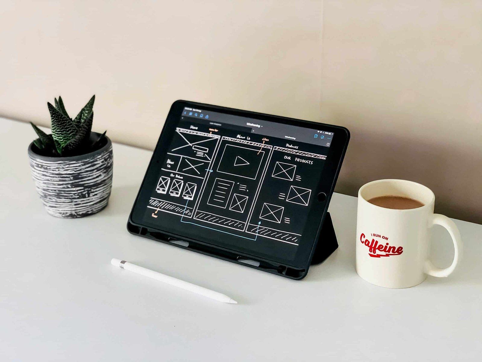
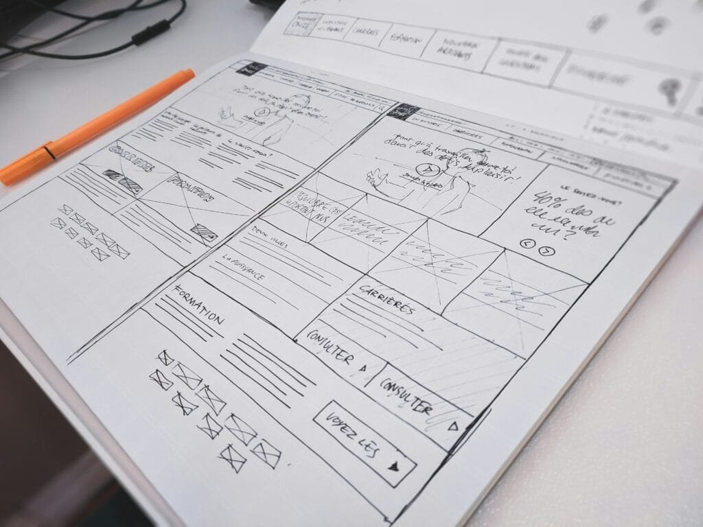
Creating Wireframes in Figma
Wireframes serve as the foundational blueprint of any digital design project, enabling designers to visualize layout and functionality before proceeding to more refined stages of design. Essentially, a wireframe is a simplified representation of a website’s structure, devoid of visual styling or detailed content. By focusing on the basic arrangement of elements, wireframes help to clarify the functionality of each component and enhance collaboration among team members during the design process.
In Figma, creating wireframes involves a straightforward yet effective approach. To begin, launch a new design file within Figma and set up your canvas according to the intended screen size, whether for desktop or mobile. The next step is to utilize Figma’s robust shape tools, which allow designers to generate essential components such as buttons, menus, and containers. These shapes can be easily adjusted with Figma’s intuitive drag-and-drop interface, providing a flexible way to explore different layout options.
Add relevant text using the text tool to label the wireframe components, offering context and functionality descriptions for each area. This step is crucial; clear labeling contributes significantly to the overall comprehension of the wireframe. You can utilize blocks of text to illustrate content areas, headers, and footers, ensuring that each section of your design communicates its purpose effectively.
Figma also offers the capability to create reusable components. By designing frequently used elements as components, you can streamline your workflow, allowing for consistency throughout the wireframe. Utilize layers and grouping features to maintain organization and ease of navigation as your wireframe develops. By following these steps, you will have a functional wireframe that not only sets the stage for visual design but also enhances your project’s clarity and direction.
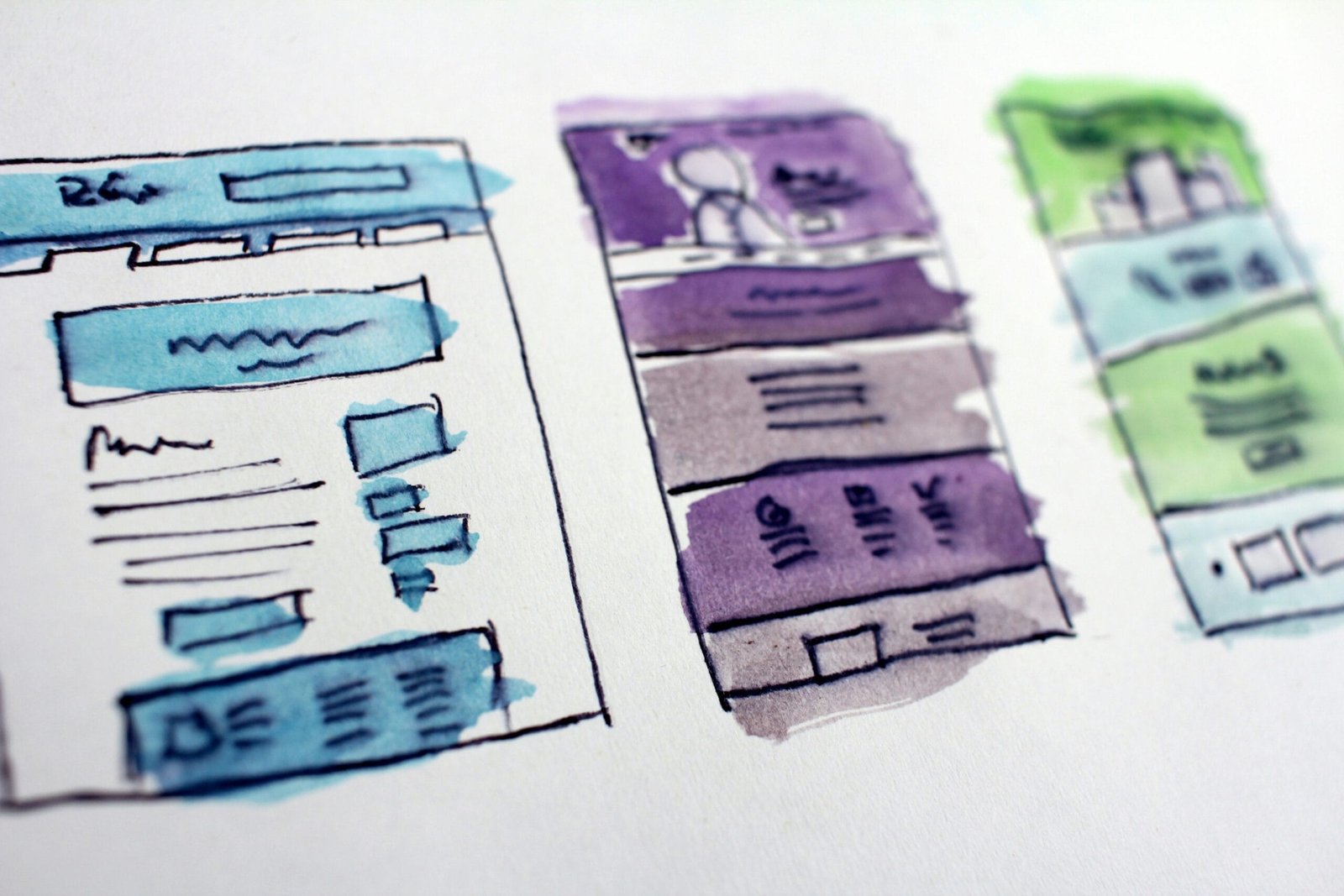
Designing High-Fidelity Mockups
Transitioning from low-fidelity wireframes to high-fidelity mockups is a crucial step in the website design process. In Figma, this phase emphasizes enhancing your design to better represent the final product. High-fidelity mockups incorporate detailed visuals, including colors, typography, images, and various design elements, allowing stakeholders to visualize the end result more accurately.
To begin, start by selecting a color palette that aligns with your brand identity. Utilizing tools within Figma, you can assemble a color scheme that is both aesthetically pleasing and functional. It is important to ensure that colors communicate the messaging of your site while also maintaining good contrast for accessibility purposes. Next, focus on typography. Choose fonts that complement your design and ensure readability across different devices. Figma offers a vast selection of font options, and it’s beneficial to create a typographic hierarchy that distinguishes headings, subheadings, and body text.
Once colors and typography are established, integrate high-quality images and icons to enrich the mockup. Figma allows the import of these assets, which should align with your design language and maintain a consistent style throughout the mockup. Attention to detail is paramount; consider the spacing, alignment, and placement of elements carefully to create a harmonious layout. Furthermore, defining a cohesive design system can significantly ease the design process. This system should include reusable components, such as buttons and form fields, ensuring uniformity across the mockups. Leveraging Figma’s component features can streamline updates, enhancing the efficiency of your workflow.
Ultimately, designing high-fidelity mockups in Figma not only offers a glimpse into the finished product but also facilitates feedback and iteration. Engaging users and stakeholders during this phase can yield valuable insights, guiding you toward finalizing a highly effective design.
Utilizing Components and Assets in Figma
When mastering website design in Figma, understanding the role of components and assets is crucial for enhancing the efficiency and consistency of your projects. Components serve as reusable design elements that can significantly streamline the design process. By creating components for repeated design elements, such as buttons, headers, and icons, designers ensure a cohesive look throughout the project. Modifications made to a master component automatically update all instances of that component, allowing for swift adjustments and reducing redundant work.
To create a component, simply select the desired element in your design and choose the “Create Component” option. Components can also have variants, which allow you to define multiple states or styles for a single element, such as hover or active states for buttons. This functionality is vital for dynamic website design, as it keeps the visual language consistent while allowing for flexibility in interaction.
In addition to components, Figma offers asset libraries that enable designers to store and organize reusable assets effectively. By creating an asset library, you can populate it with components, icons, color styles, and typography, making them readily accessible for future projects or collaborations. This organization not only saves time but also aids in maintaining a uniform design system across different pages or products.
Furthermore, Figma allows designers to utilize shared styles for text and colors, which ensures that typography remains consistent and color schemes are applied uniformly. By adhering to these practices, designers can navigate collaborative environments more easily and facilitate communication regarding design elements. Ultimately, effective use of components and assets in Figma is essential for delivering professional and cohesive website designs that enhance the user experience.
Collaboration and Feedback in Figma
One of the defining aspects of Figma is its robust collaboration features, which enable designers to work together in real-time, regardless of their geographic locations. By allowing multiple users to access and edit a design simultaneously, Figma fosters a more dynamic and engaged design process. This real-time capability not only enhances communication among team members but also accelerates the decision-making process, as everyone can see changes as they happen.
Sharing designs with stakeholders in Figma is seamless. Designers can generate shareable links, allowing stakeholders to view or edit the designs with ease. By setting permissions, designers maintain control over who can comment on or modify the work. This level of control is crucial in ensuring that the design process remains organized and that feedback can be efficiently managed. Furthermore, Figma supports various feedback mechanisms, such as comments directly on the design files, which allows team members or stakeholders to leave remarks or suggestions in context. This commenting feature helps capture insights and facilitates discussions centered around specific design elements.
An essential aspect of collaboration involves iterating on feedback, and Figma streamlines this process through version history. This feature allows designers to track changes over time, providing the ability to revert to previous versions if necessary. It also fosters accountability, as team members can see who made specific adjustments, promoting transparency in the design process. By combining real-time collaboration, straightforward sharing, efficient feedback, and comprehensive version control, Figma empowers teams to create superior designs collaboratively. This holistic approach to teamwork not only enhances productivity but also leads to better design outcomes as stakeholders and team members engage more directly with the project.
Prototyping Your Designs in Figma
Prototyping is a crucial step in the website design process, allowing designers to create interactive representations of their ideas. Figma excels in this area, offering a range of tools and features to transform static designs into dynamic prototypes. This functionality is particularly important for showcasing the user experience, enabling designers to simulate user flows that are fundamental to client presentations or team discussions.
To begin prototyping in Figma, users should first ensure that their designs are fully completed and organized within the interface. Once the foundation is set, designers can proceed to create links between frames, which act as buttons or navigational elements in the prototype. Linking various screens allows viewers to transition smoothly from one state to another, mirroring how they would interact with the live website. Simply select an object, navigate to the ‘Prototype’ tab, and drag the connector to the target frame. This straightforward process makes it easy to visualize how users will navigate through the website.
Furthermore, Figma allows for the addition of transitions and animations. Designers can enhance the prototype’s interactivity by setting transition effects such as dissolve, slide in, or move in. These effects not only elevate the overall aesthetic appeal but also provide insights into how elements respond to user interactions. Adjusting the duration of these transitions can create a more lifelike experience, helping stakeholders understand the intended user experience.
Finally, once the prototype is crafted, sharing it with clients or team members is a seamless process. Figma provides the ability to generate shareable links, ensuring all participants can experience the interactive prototype without requiring extensive software. As a result, prototyping in Figma not only strengthens design validation but also fosters collaboration, paving the way for informed decisions before development commencement.
Exporting Your Designs for Development
Once the design phase is complete, the next critical step in the website design process involves preparing and exporting the design assets for developers. This transition from design to development is vital for ensuring that the envisioned user interface is implemented accurately. Figma provides several export options that cater to different needs and formats, allowing designers to create developer-friendly assets. Popular formats include PNG, JPEG, SVG, and PDF, each serving different purposes. For instance, PNG and JPEG are suitable for raster images, while SVG is ideal for scalable vector graphics.
When exporting assets, it is essential to consider the size and resolution. Ensure images are optimized for the web to maintain fast loading times without sacrificing quality. Using the appropriate compression methods can help achieve this balance, saving bandwidth while delivering a visually appealing product. Figma allows designers to specify export settings, including resolution and format, directly within the design files, streamlining the process for developers.
Furthermore, establishing effective communication with developers is crucial. A design handoff document should be created to provide a comprehensive overview of the project. This document should include specifications such as font styles, color palettes, component sizes, and interactive behavior. Including a style guide is particularly beneficial, as it serves as a reference for maintaining consistency throughout the development process. It is also advisable to create a folder containing all necessary assets, which can be easily accessed by developers.
In conclusion, successfully exporting designs involves careful consideration of formats, resolutions, and a cohesive handoff document. Following these guidelines ensures that developers receive the information required to translate the design effectively into a functional website, thus bridging the gap between design and development seamlessly.